- This topic has 1 reply, 1 voice, and was last updated 10 years, 10 months ago by
Anonymous.
-
AuthorPosts
-
May 8, 2014 at 6:53 am #33571
Learnist Careers
ParticipantWriting a good CV and making sure it stands out is very important when this is a document that can stand between you getting a job that you really want. Therefore it is very important to make sure that you consider all aspects of your CV, not just the content but how it looks and how easy it is to read to employers and recruitment agencies.
Sometimes the right font isn’t considered important but it should be because if a CV is hard to read then it will not inspire people to look at it carefully and give it the time it deserves.
There are some good tips below on what to look at and how to choose the best font to create a winning CV.Look at other people’s examples
It’s a good idea to look at what other CV’s people have done but you must remember to be objective when doing this and also it is good to remember that although a CV is largely a matter of opinion, you want that opinion to be good and for your CV to come across well. It’s advisable to not only look at the content but the font that the CV is written in what it looks like on paper.
Look at what the company use when they advertise
Getting an idea of good business like fonts can be done by looking at job adverts and how companies write on their website. If a company is using a particular font and it looks professional and is easily read then it must be a good choice for your CV.
Creative roles may use more creative fonts
Understandably the more creative a position you are looking for, the more likely you are to use a creative type of font but is it easily read? Do you feel that you are having to concentrate harder to distinguish what words are what? That is not ideal for an important document such as your CV.
Can you read the CV yourself or can a friend or relative?
Getting someone to read your CV for you and get their opinion on not only how it reads but how it looks and how easily they can read the particular font you have chosen.
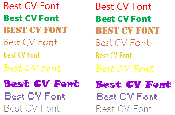
Type out a few fonts and pick what looks professional and suits your industry
Which one of these fonts looks the most professional and that you can read easily and feel sure that an employer will not have to read it twice only unless it interests them which is a good thing!
By actually looking at fonts written down and obviously the colours are for highlighting purposes only in this document and that a CV should always be written in black ink but it gives you are idea of how easily you are able to read a chosen font.
Fonts
Calibri – some people say that Calibri is the font that was made for reading on a computer screen. It is very clear and the words are spaced out so that it is a very good font for a CV to be written in and read either on paper or on a screen.
Ariel – is also a very clear font that is easily read and the lines of the words are very clean.
Verdana – a slightly bigger style font but still very clear just more chunky overall words.
What size font?It is also important to consider what size font you should choose too. It is normal practice to use a size between 10 – 12 but depending on how long your CV is you may have to choose smaller size to ensure that your CV does not start to look too long. Test them out as you are doing your CV and decide which overall looks better and has the most impact.
Sections/Paragraphs
It is important to remember when choosing the right font and the right size that you can make certain sections stand out by doing titles slightly larger say 14 or 16 in size and maybe also in bold or underlined. Try not to do too many exclamation marks or other features, they do not stand out in the way that you would imagine.
It is important to get your CV right and if you spend time doing it once, then you just need to adapt the wording at a later stage for updates and depending on what job you are applying for.
May 8, 2014 at 6:09 pm #36099Anonymous
GuestThis is really a great one. Thank you.
-
AuthorPosts
- You must be logged in to reply to this topic.
