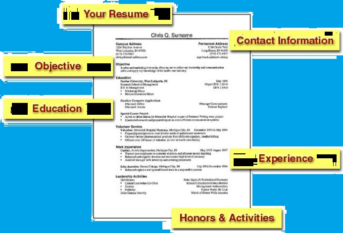
A resume format for one job seeker may not be the best one for you. It often depends on your work history, job search and your experience and overall background. This is why it’s important to know about the different format options and to understand what not to do on a resume.
FORMAT:
When you have a well-formatted resume it’s almost as important as having a well written one. Most hiring managers receive a pile of resumes of qualified candidates. They scan them quickly before they can decide whether they want to read it further. What typically stands out to them the most is the resume format. It is always the first item they notice when scanning through the resumes. Always keep in mind, these rules when formatting your career document.
HEADER:
Make your name bold and larger than the rest of the resume. You want to ensure your name stands out so any hiring manager who reads it will most definitely remember you. List your current address, phone number and e-mail address below your name.
Related: 3 Key Things to Get Right When Writing Your CV
Jane Doe
123 Any RoadWashington, DC 20500
[email protected]555-123-4567
HEADLINES:
The headlines will typically be in all caps and in bold. You should not exceed 14 point font for headlines; the rest of your document shouldn’t exceed 12 point font.
MARGINS:
Make sure your resume has one inch margins on the top, bottom, right and left of the document. Don’t center your content on your resume, but rather ensure to utilize the left justification. Your font style and size should be consistent.
EXPERIENCE:
If you have an extensive work history, you don’t have to list all your experience and employers. Include the last ten to fifteen years of employment. Keep in mind that relevant experience can include internships and volunteer experience as well as coursework.
EDUCATION:
List your most recent education first. Include your university, major and graduation year. If you have a high GPA, include it.
TEMPLATES:
Avoid using templates that are outdated and that will make your resume appear generic and uninviting. In addition, these templates won’t translate well when you upload them to a job search engine web sites. On the internet perform a search for resumes on your industry to find a template that makes the most sense for the position you are seeking.
Related: 5 Great Tips for Writing a Successful CV
PAGES:
You have probably heard the saying, “Keep your resume to one page.” This may be true for most cases. Your resume should typically fit on one page if you’re a new college graduate. However, many employers are accepting longer resumes. As long as it’s relevant and persuasive, don’t shy away from adding the second page of accomplishments. However, if you have extensive experience, ensure the resume is limited to only two pages.
IMAGES:
Don’t insert pictures or images into your career documents. Even if you are applying for a position in the creative arena, do it on a separate portfolio of your work.
SPACING:
Be aware of all spacing and tabbing when attempting to align your resume. Ensure to stay consistent in the information on the page. Utilize the tab key, rather than spaces. Keep in mind the receiver of the document may have a different software version than you. They may not see the career document you are sending in the same way. The margins may reset, paragraphs or bullet points may shift. This is why it’s so imperative to keep the spacing consistent.
Don’t forget to ask your co workers or friends to review your resume. Sometimes more than one set of eyes proofreading your career documents can go a long way. Print out your resume and check the margins, ensure the document is accurately set and the overall appearance is visually appealing. When it comes to your resume, a simple appearance and great writing will get you the position you are seeking!

Leave a Reply